SR PLAY
UI REDESIGN FOR THE SWEDISH RADIO
UI for the Swedish Radio


SR Play
Redesign the UI for the Swedish Radio
| Client: Swedish Radio
| Agency: Doberman
| Role: Product Designer
| Process: Visual UI, workshops & facilitation

Challenge
The SR Play app is today one of Sweden’s most downloaded and used applications, with user-groups that includes a lot of different user behaviours. In this assignment the main challenge was to make the UX inspire users to user the app more often and more important to broaden their consumption of the new listening material.
Result
A user experience that introduce the user to new features such as program cards, home feed and a new player. We changed the entire structor of the UX and create a system where the user got surprised with new listening material and easier find there favorites.

“How might we improve the listening experience for the Swedish Radio’s users by providing a more personalized content?
”

[ UX principles ]
To understand the product we need to deepen our knowledge of what challenges the radio as a whole is facing. Products like Spotify, Netflix and other streaming services has changed the way we experience listening content, video and music. We needed to cherry pick the best practices of todays streaming services and apply it into the UX.
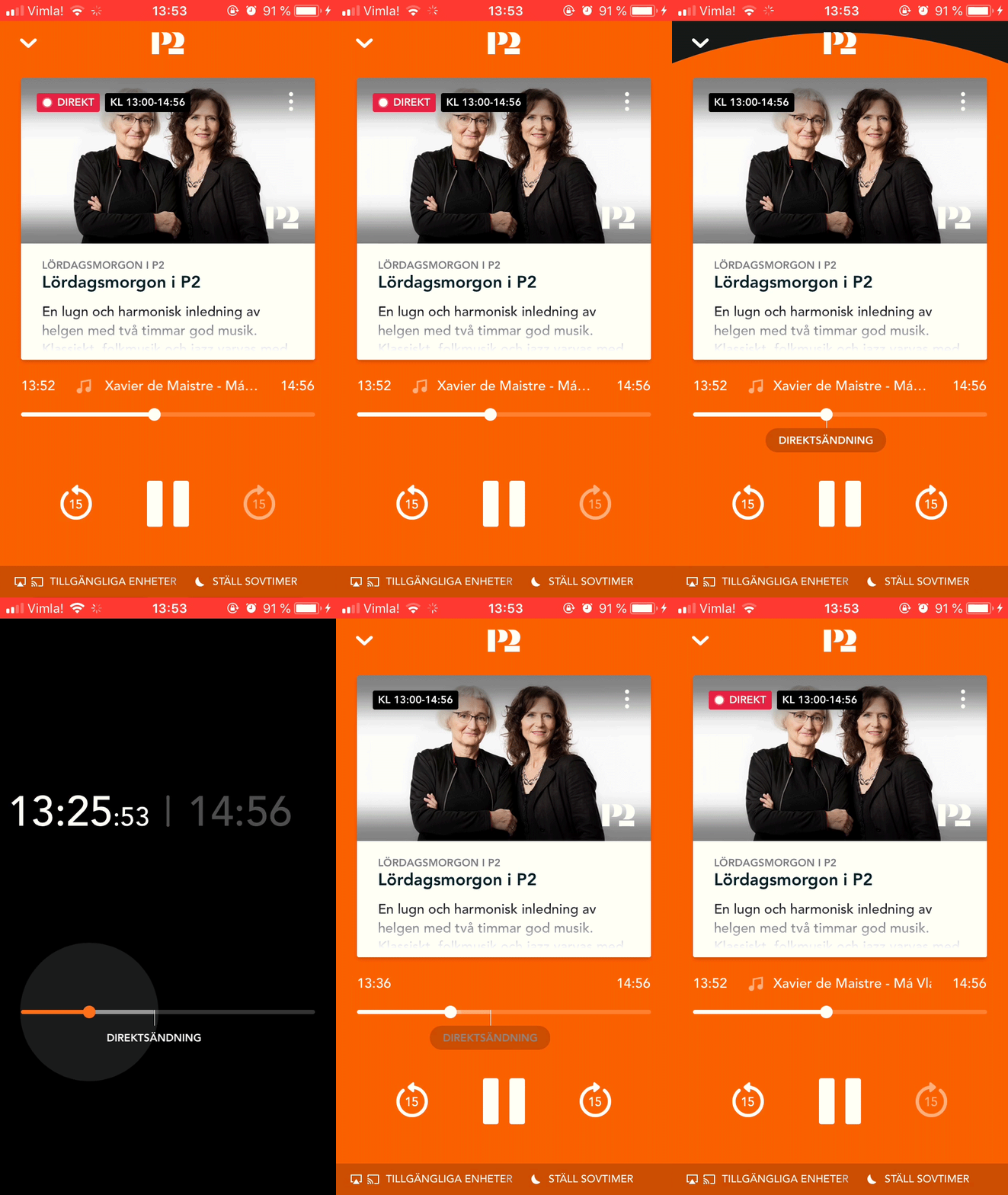
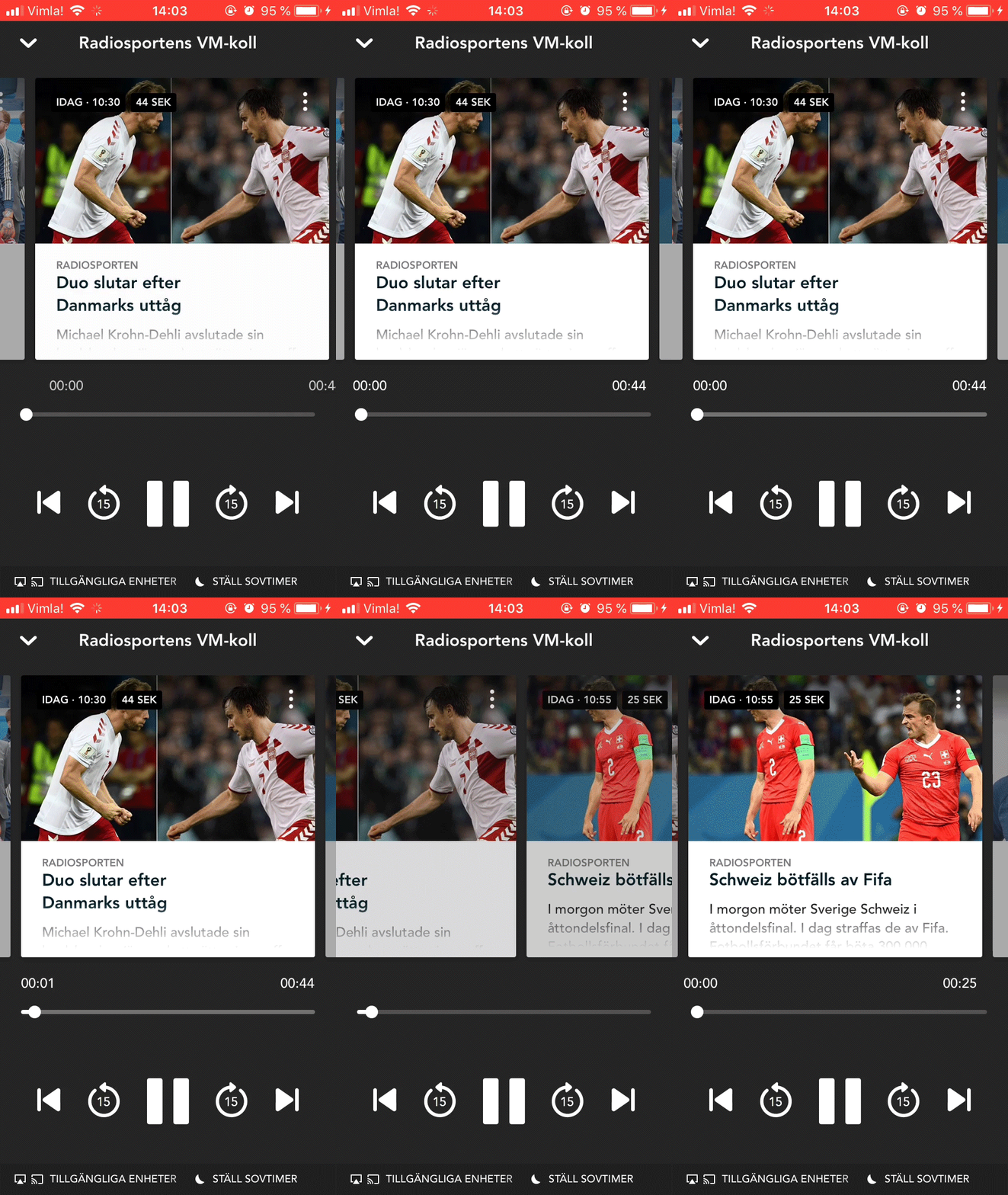
There are two design elements that we introduced to the user. The first one was to re-design the Player in the app. By making the "play & stop" function a joy to use and the scroll functionality similar to scrolling back in a video player we lifted the experience of using the player.


“We needed to cherry pick the best practices of todays streaming services, apply it into the UX of SR Play and take its vast group of users behaviours inconsideration.”

The second design element we introduced was "content cards". Cards like; program-cards, episode-cards, live-program- cards, created a frame-work for the app to hold and contain more recommended content in the future.
[ Lists & episodes ]
“We tried to make it easier for the user to navigate and pick out episodes by creating recommended clusters.”

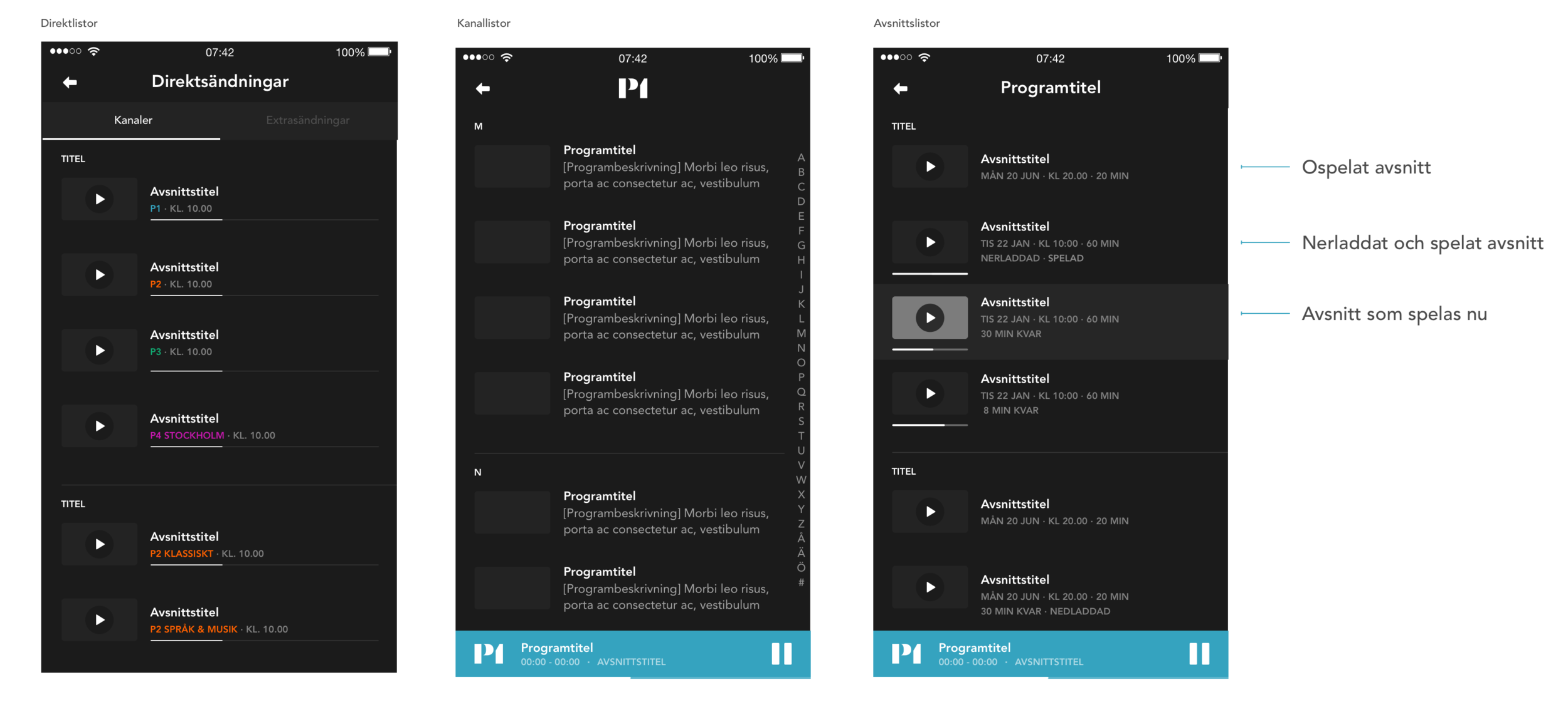
“To be able to see what episodes you as a user already started to listen to, we introduced a simple progress bar underneath the thumbnail. For a life sent channel we presented a longer progress bar underneath the program information. ”
In each program page we gave the user the option to follow a program by "harting" it, this function already existed in previous releases however the function was seldom used. We made user-test on where to make a better placement with resulted in the "hart button".
“The content was a mix of using algorithms and get journalists to hand picking the listening content. Perfect combination between humans and narrow AI. ”
“[...]maybe the biggest change in the app was introducing the user to a “home feed” and a new meny. This made it further more easier follow content as to find new discoveries within the rich library ”

The last and maybe biggest change in the app was introducing the user to a "home feed" and a new menu. This made it further more easier follow content as to find new discoveries within the rich library.
[ Apple Watch ]
The apple watch had simple UX principles;
“1. Easy to understand
2. Only the essential need to be there - if not, just throw it!
3. Simplicity”


Try the experience?
