Air
UI DESIGN FOR ASTHMATICS
UX


Challenge
For many patients it is important to have an overview of their lung capacity and to share it in an easy way with the medical staff. The challenge was to create a new look and feel for the UI, closer to the brand, Nuvoair. The UI has to be consistent, easy and beautiful, helping both patients and doctors to properly analyse the lung capacity.
Result
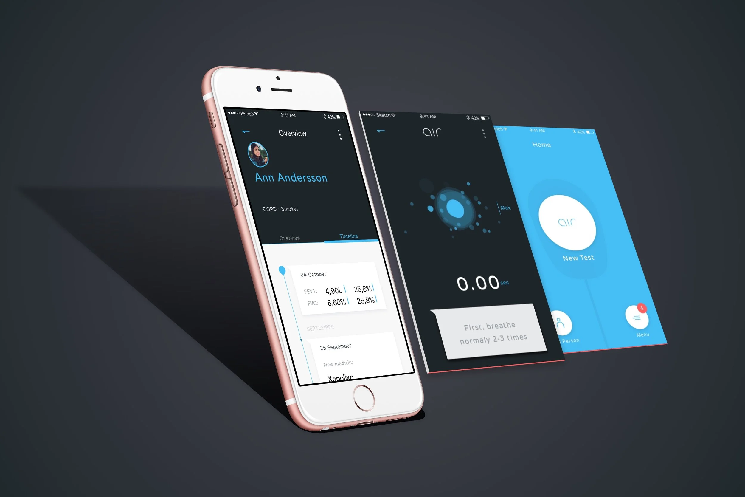
Inspiration came mainly from the existing hardware and its sleek dark matte product. I was also intrigued by creating a dark base and combine it with neon blue as a distinguished accent color. Elements that creates an airy look and gives a trustworthy character.

“How might we make it easier to understand your breathing condition over time by providing a easy to use UI?”
[Typography]
Picking out the typography was a joy and since the already existing logotype had a smooth softness to itself I found Rubrik to fit very well, being rounded in its edges and easy to read on a screen. Combining it with SF Pro UI Display worked well and gives a balances expression.
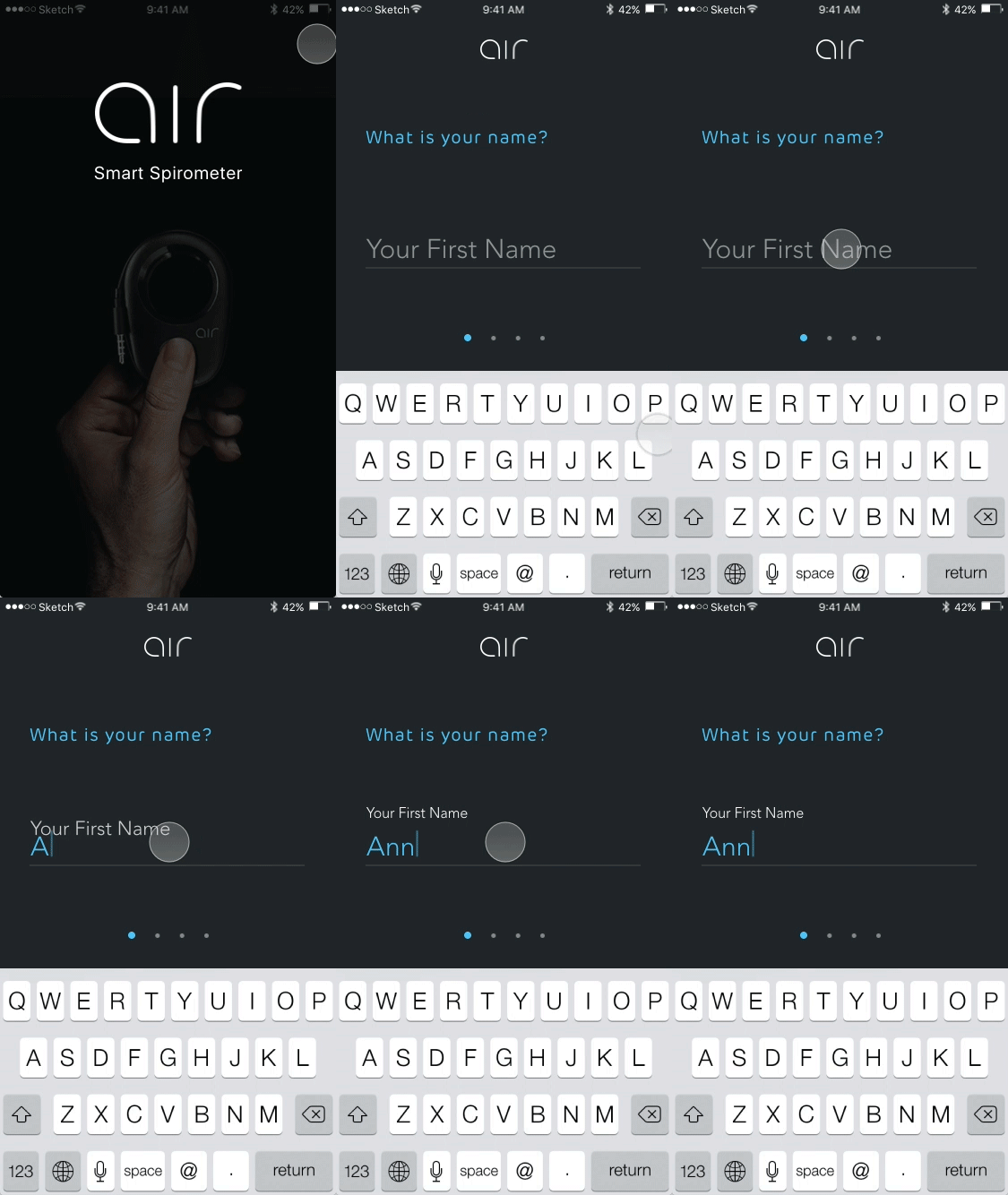
One challenge in the UX is that there is a lot of information fields that needs to be filled in by the patient and the doctor. This requires for a easy step-to-step flow of the text fields.
As a user your focus is centered to the current action, one step at the time in other words. For each active stage there is a specific element. First you see what to type and once typing the information jumps over the active line and becomes the description information of that text field.
The text fields that needs to be stacked in one formula opens up in several sections so that the user can type, scroll or click in the right information.


“Text field - As a user your focus is centered to the current action - one step at the time in other words. ”


[ UI Design Explorations ]


“The over all UI elements are light and since the spirometer is all about measurements the curves are important. Core is that they need to be easy and be appealing to read. A rounded and light impression just like the typography. ”


Try the experience
